
Blog
Investment Decisions: Quantifying Financial Risk from Climate Hazard Scores
By: Auras Tanase -
19 January 2026

We love our data, and now that you're here, you're one step closer to loving it too.
A wide sample of data, so you can explore what is possible with our data
Choose ->
built with procurement in mind. Focused on manufacturers, products and more
Choose ->
built with insurance in mind. Focused on classifications, business activity tags and more
Choose ->
built with sustainability in mind. Focused on sustainability commitments, and environmental and social governance insights.
Choose ->
built with strategic insights in mind. Focused on market trends, competitor analysis, and industry-specific data
Choose ->

Keep up to date with our technology, what our clients are doing and get interesting monthly market insights.

Key Takeaways:
Avoiding and completely eliminating climate-related threats is impossible.
However, the right data and methods for quantifying financial risk at specific locations can help you navigate them.
Understanding the relative exposure of different assets depends on linking each hazard’s severity to the probability of disruption, damage, or lost productivity.
This article gives you a step-by-step guide for translating physical climate hazards into actionable, financially informed insights for smarter portfolio and operational decisions.
Before you can quantify climate risk in financial terms, you need a complete, geo-accurate map of a company’s entire physical footprint.
A detailed inventory of facilities, warehouses, data centers, and key supplier nodes forms the foundation for understanding each asset’s specific vulnerability to different climate hazards.
While this may seem like a straightforward first step, it’s often where the largest information gaps arise, creating unreliability further down the road.
One of the most common issues is the overreliance on corporate addresses.
Administrative or billing addresses cannot deliver the spatial precision required for investment-grade climate modeling.
High-level climate-risk maps, such as AllianzGI’s global risk view, provide useful country-level orientation.
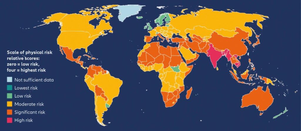
Source: Allianz
However, they lack the resolution needed to evaluate real physical exposure.
Physical hazards are shaped by highly localized factors such as:
These variables can change significantly across small geographic distances, which is why two facilities located in the same district can have different financial impacts.
In other words, if you don’t use verified coordinates, you increase the likelihood of both over- and underestimating climate exposure.
A practical illustration comes from the analysis of flood-risk zones across Kwara State settlements in Nigeria.
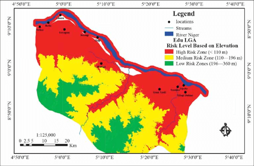
Source: Research Gate
Segmenting areas by elevation revealed three distinct risk categories, with low-risk zones situated above 196 meters.
This demonstrates how asset-level elevation, which is data that can’t be inferred from a mailing address, drastically alters the risk scoring outcome.
And the cost of ignoring spatial precision can be very high, especially if we take a closer look at the data.
Namely, the European Central Bank research revealed that weather-related catastrophic losses accounted for 80% of all insured losses in 2018.
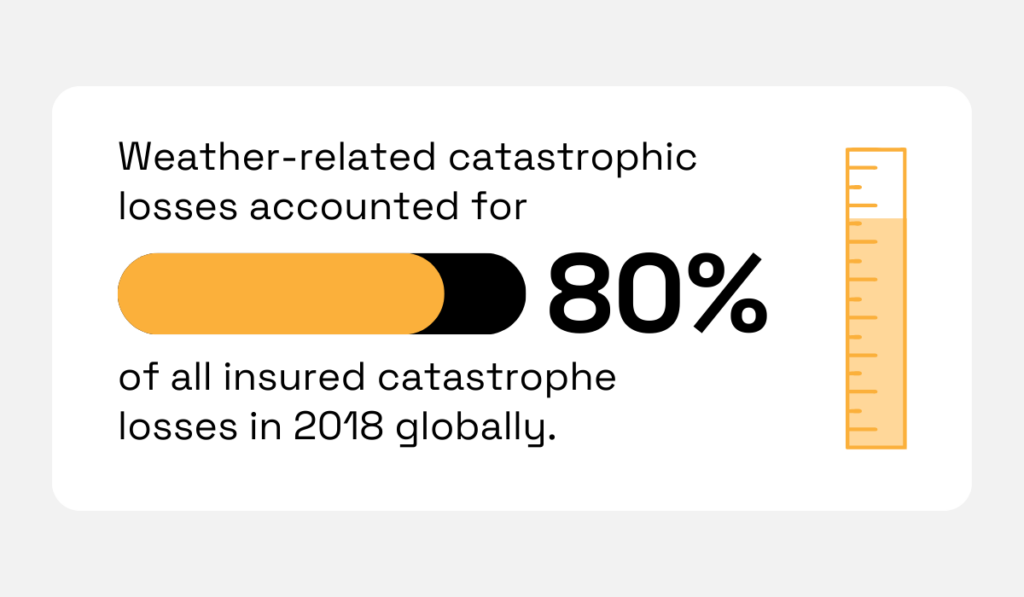
Illustration: Veridion / Data: European Central Bank
Precise spatial mapping plays a fundamental role in investment-grade climate analysis.
To ensure data integrity, you need to validate the exact latitude and longitude of every asset in the portfolio.
Once you’ve established spatial accuracy, it’s essential to link each site to its operational role.
For example, a large warehouse may contribute marginal revenue, while a small data center in a high-risk floodplain might support a core service with high financial exposure.
This way, investors understand which assets support which revenue streams or which suppliers, products, and business lines depend on them, helping them determine financial materiality.
Finally, visualizing your asset footprint on a GIS platform allows you to identify clusters, geographic concentrations, and potential single points of failure across the network.
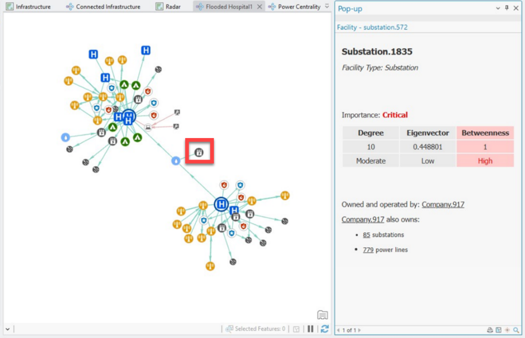
Source: ESRI
This spatial visualization becomes the analytical base layer for every subsequent stage of climate-risk modeling, from hazard overlays to damage functions and probabilistic assessments.
To sum up, a precise, operationally contextualized asset map enables investors to translate physical climate exposure into financial impact with clarity, consistency, and confidence.
Once you have a verified, spatially accurate asset map, the next step is to enrich it with downscaled climate hazard data.
Downscaled datasets provide localized projections for hazards such as precipitation, wildfires, extreme heat and drought, cyclones, coastal inundation, or chronic sea-level rise.
Global climate models (GCMs) operate at coarse spatial resolutions, focusing on areas anywhere between 50 to 250 kilometers, but these outputs become the basis for producing more refined results and actionable insights.
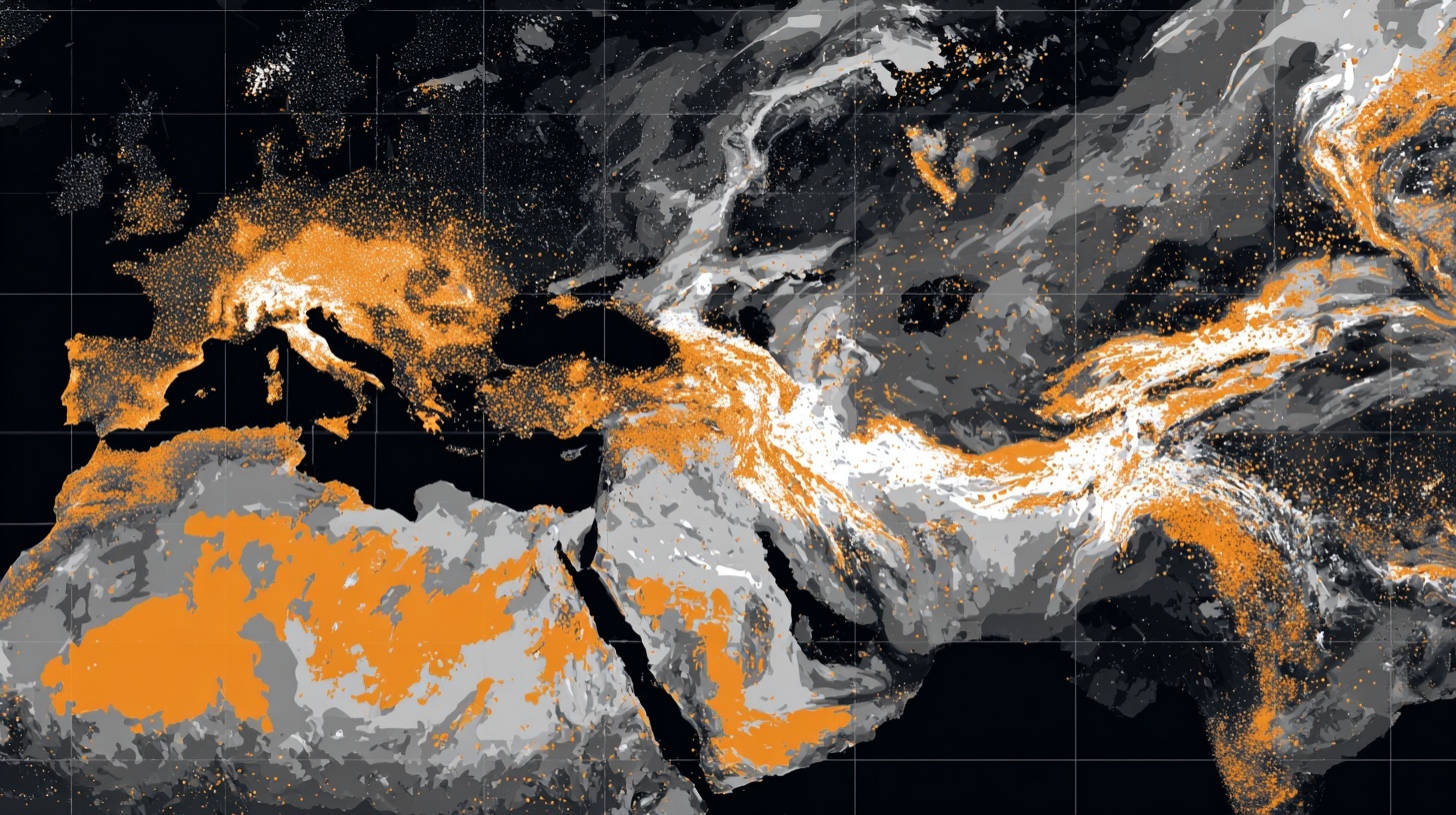
This is neatly summarized by Carbon Plan’s research scientist, Oriana Chegwidden, and former program manager, Sadie Frank, in their research focusing on data for climate action.
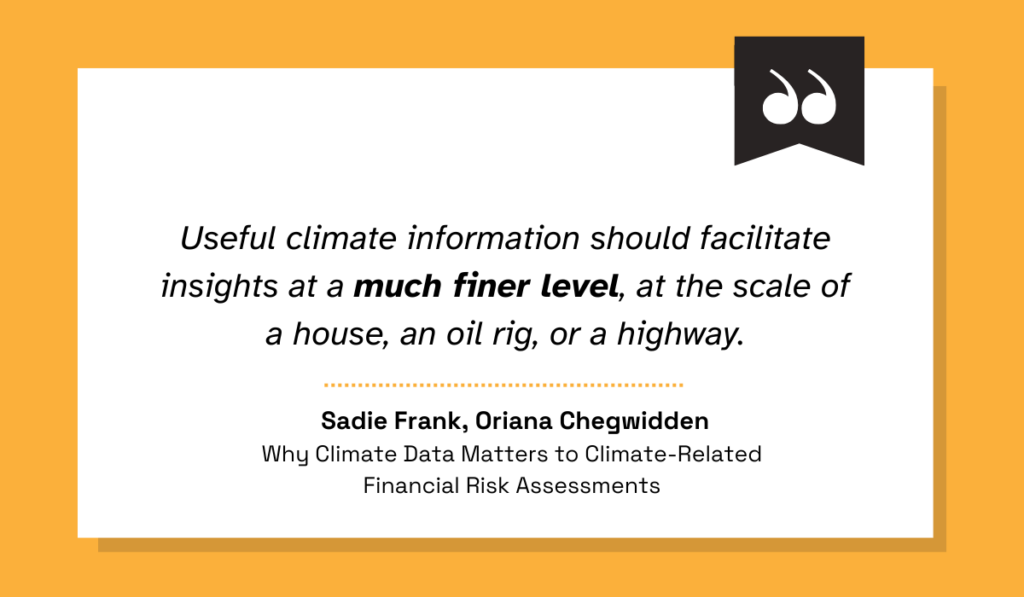
Illustration: Veridion / Quote: Carbon Plan
Indeed, downscaled models zoom into actionable details that can be as fine as 1 km or 100 meters.
But why does this matter?
Simply put, the difference in resolution resolves any potential uncertainties regarding the affected area.
While GCMs can show that some region faces elevated flood risk, they can’t reveal which facilities sit inside a future inundation zone or how heat stress might impact an industrial cluster.
Fortunately, downscaled data bridges this gap by integrating local weather patterns, topography, hydrology, and land-use characteristics, from vegetation to infrastructure density.
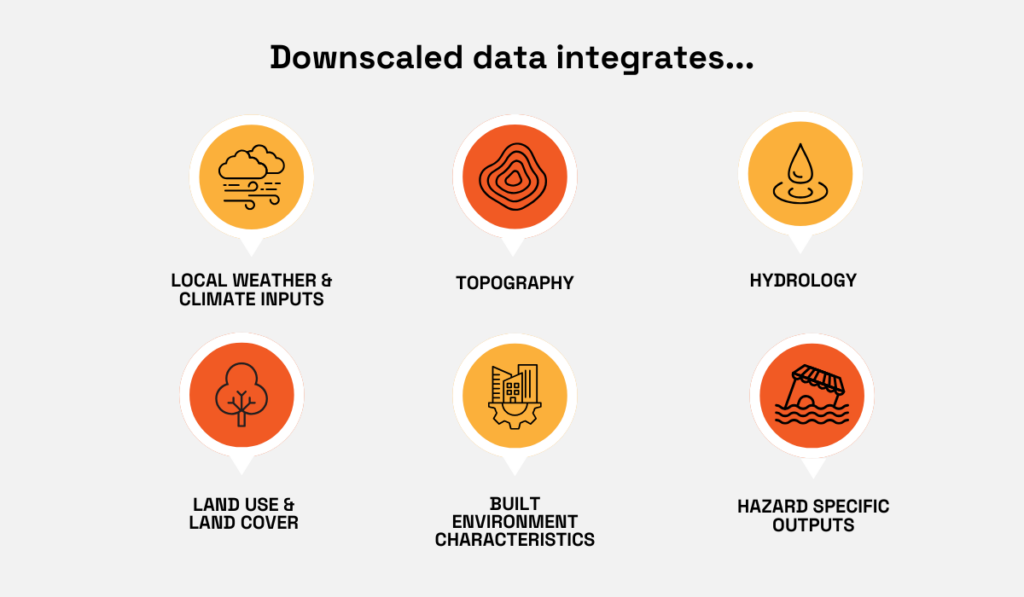
Source: Veridion
Hazard-specific outputs, such as flood maps or wind vulnerability zones, complete that picture, giving you precise projections that align with the true physical environment in which company assets operate.
Having a forward-looking view is essential for investors because climate exposure compounds over time, and you want to be able to answer these and other key questions:
Scenario-based assessments add another layer of clarity.
With downscaled datasets aligned to multiple Shared Socioeconomic Pathways (SSPs), you can compare outcomes across 2030, 2050, or 2100.
For instance, recent research on hurricane-related flooding shows that historical 100-year flood levels could occur annually in the northeastern United States by the end of the century under high-emissions assumptions.
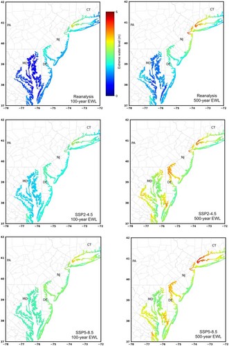
Source: AGU
Downscaled projections allow you to translate findings like this into precise, asset-level financial implications.
In practice, this means overlaying future hazard maps directly onto your investment footprint and pairing them with historical observations.
Tools such as Carbon Plan’s Explorer show these key mechanisms on a more regional scale.
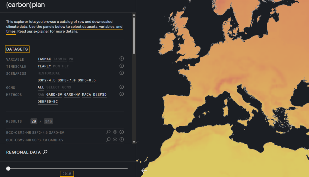
Source: Carbon Plan
All in all, high-quality downscaled climate data ensures that your climate-risk assessment reflects the true environmental conditions surrounding each asset and lays the groundwork for realistic estimates of future financial exposure.
Once hazard intensity is mapped, the next step is to translate those physical conditions into actual loss estimates.
This is where damage functions become essential.
These mathematical models link hazard severity, such as water depth or wind speed, to physical asset damage.
Ultimately, this turns abstract climate risk into numbers that investors, underwriters, and asset managers can act on.
This conversion becomes especially important during events where losses escalate rapidly.
Just consider the 2025 Los Angeles wildfire season and the resulting losses.
Drawing on Berenberg’s analysis, multiple media outlets reported on the expected $1 billion losses for major insurers.
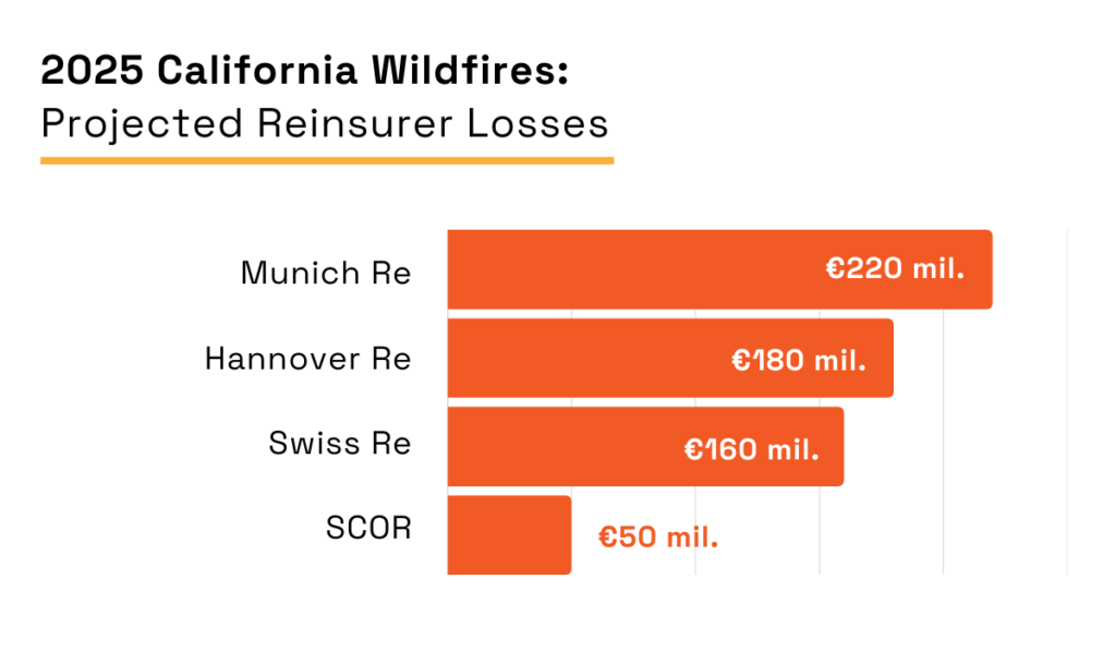
Illustration: Veridion / Data: Berenberg Equity Research
While these early projections were grim, the total tally reached $40 billion of insured losses.
The 2025 California wildfire episode turned into the highest-ever insured loss in terms of wildfire events, the consequences of which immediately spilled into financial markets and regulatory discussions.
Reflecting on even greater potential losses in the future, Denise Rappmund, senior analyst at Moody’s, summarized the overall impact bluntly:
These events will continue to have widespread, negative impacts on the state’s broader insurance market. Increased recovery costs will likely drive up premiums and may reduce property insurance availability.
For investors, these concerns are precisely why it’s so important to apply damage functions correctly and in a timely manner.
Without them, hazard layers can only help you assign risk to specific assets, rather than providing you with an in-depth understanding of financial impact.
For starters, it’s important to note that damage functions vary sharply by asset type, construction material, age, elevation, and operational dependency.
A data center and a warehouse won’t be equally impacted by 50 cm of flooding or exposure to wildfires, just as distribution centers aren’t impacted by high winds in the same way that solar farms are.
But when you pair hazard intensity with vulnerability curves, you generate concise asset-level damage estimates under different climate scenarios.
These estimates inform everything from impairment testing to underwriting to capital allocation.
A recent systematic review of physical vulnerability data for critical infrastructure shows how robust this field has become.
The publicly available database consolidates more than 1,510 vulnerability curves, covering floods, windstorms, earthquakes, and landslides across both system-level and asset-level infrastructure.
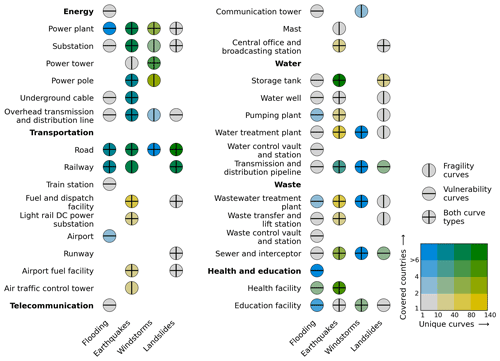
Source: EGU
Although these are developed for critical infrastructure assessments, the underlying logic of combining structural susceptibility with hazard intensity to calculate expected damages transfers seamlessly to commercial assets.
For investors, these curves offer a structured starting point:
Companies can adapt sector-level curves to their own facilities, calibrating them with local elevation, building characteristics, past loss data, or insurance claims history.
That way, a generic risk assessment turns into a tailored financial exposure model.
Ultimately, damage functions anchor your climate-risk analysis in realistic economic terms, ensuring that hazard maps evolve into credible, decision-ready financial estimates.
Probabilistic risk assessment (PRA) builds on hazard intensities and asset-level damage estimates, enabling you to quantify how financial losses would accumulate over time.
Rather than relying on raw hazard scores, PRA evaluates the likelihood, severity, and timing of loss events under multiple climate scenarios.
These assessments become the bridge between physical risk and financial exposure by focusing on annual and scenario-based losses, as well as business interruption costs.
In turn, these metrics inform:
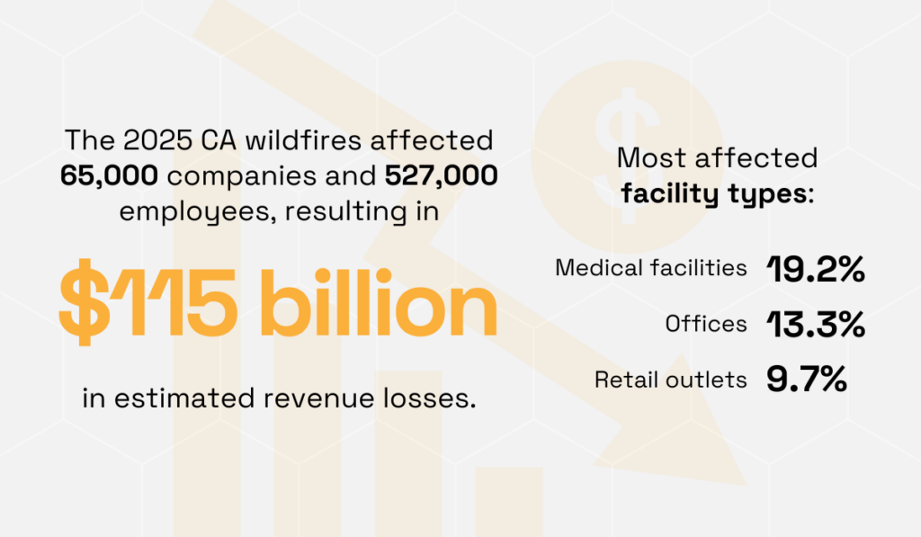
Of course, granular, high-quality data enables greater precision, as evidenced by our wildfire impact analysis focusing on commercial insurers.
The Veridion case study outlines how the aforementioned California wildfire event affected 65,000 companies and 527,000 employees, leading to $115 billion in revenue losses.
Moreover, it demonstrates the uneven nature of exposure by sector and facility type.
Source: Veridion
These patterns show why PRA must account for localized variations in asset types, economic dependencies, and operational fragility.
So, how is this level of precision achieved?
Probabilistic assessments depend on extensive asset-level information to build probability distributions rather than single-point estimates, and this is where enriched datasets significantly strengthen analysis.
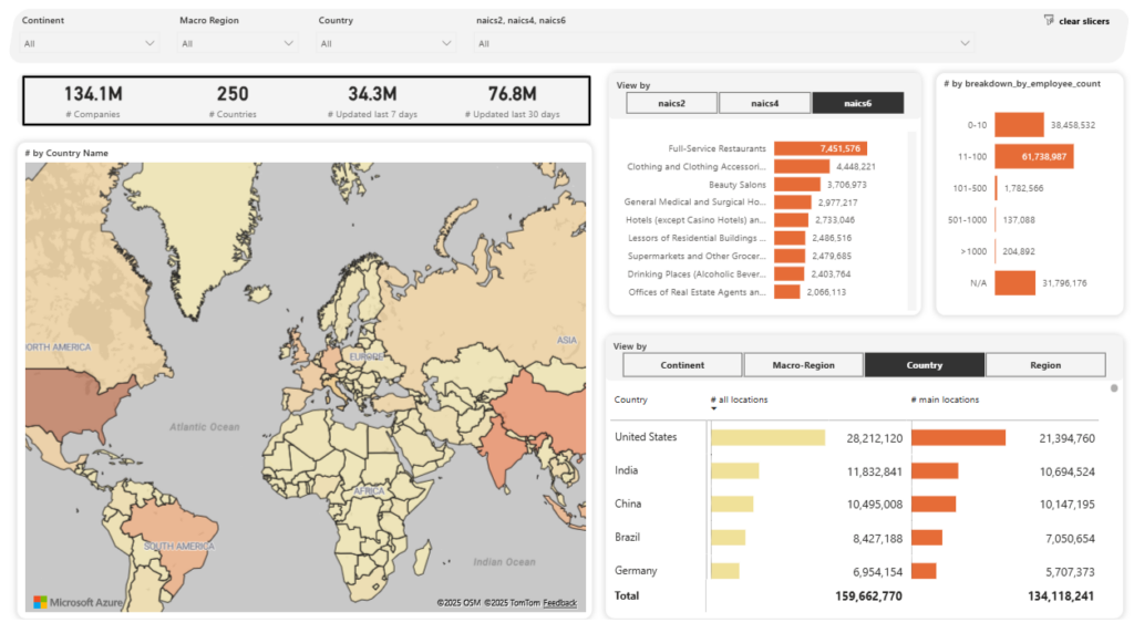
Veridion’s platform offers AI-powered intelligence across 130+ million global companies, with verified, weekly-updated data, including private firms and SMBs.
And with intuitive dashboards and natural language search capabilities, all the data you need is at your fingertips.
Source: Veridion
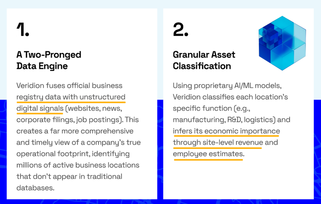
The platform combines registry sources with scraped unstructured data, spanning corporate filings, news events, job postings, operational signals, digital presence, and social-media pulse.
All in all, this multidimensional view enables more precise estimation of exposure, dependencies, and potential cascading effects.
Source: Veridion
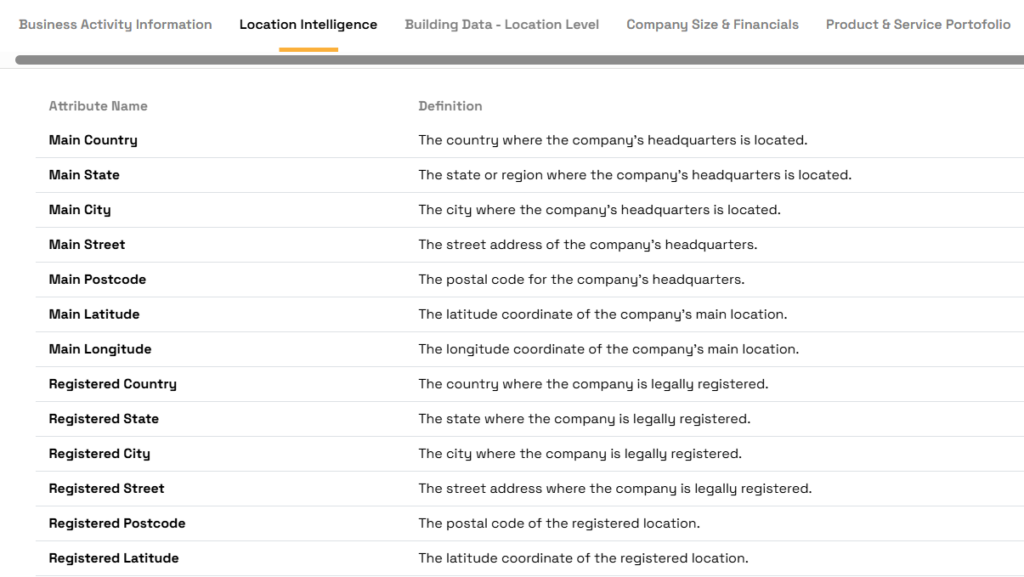
Some of the key enriched data assets in terms of climate risk include:
You can browse data points in more detail here:
Source: Veridion
While these inputs do not replace climate models, they significantly enhance PRA by grounding hazard probabilities in real-world business, building, and operational characteristics.
To sum up, probabilistic risk assessment yields accurate financial estimates, but it greatly depends on hazard data, vulnerability models, and enriched commercial intelligence.
The final step in quantifying financial risk from technical climate-risk outputs means turning them into investment-grade decisions.
Once you’ve modeled hazard intensities, vulnerability, and probabilistic losses, it’s time to shift your focus to interpretation.
In other words, the goal is to understand what those results mean for asset value, cash-flow durability, geographic exposure, and long-term capital allocation.
For instance, Veridion’s recent analysis of the UK supply chain, which overlaid storm hazard data with more than 67,000 company locations, identified over 3,200 critical infrastructure sites.
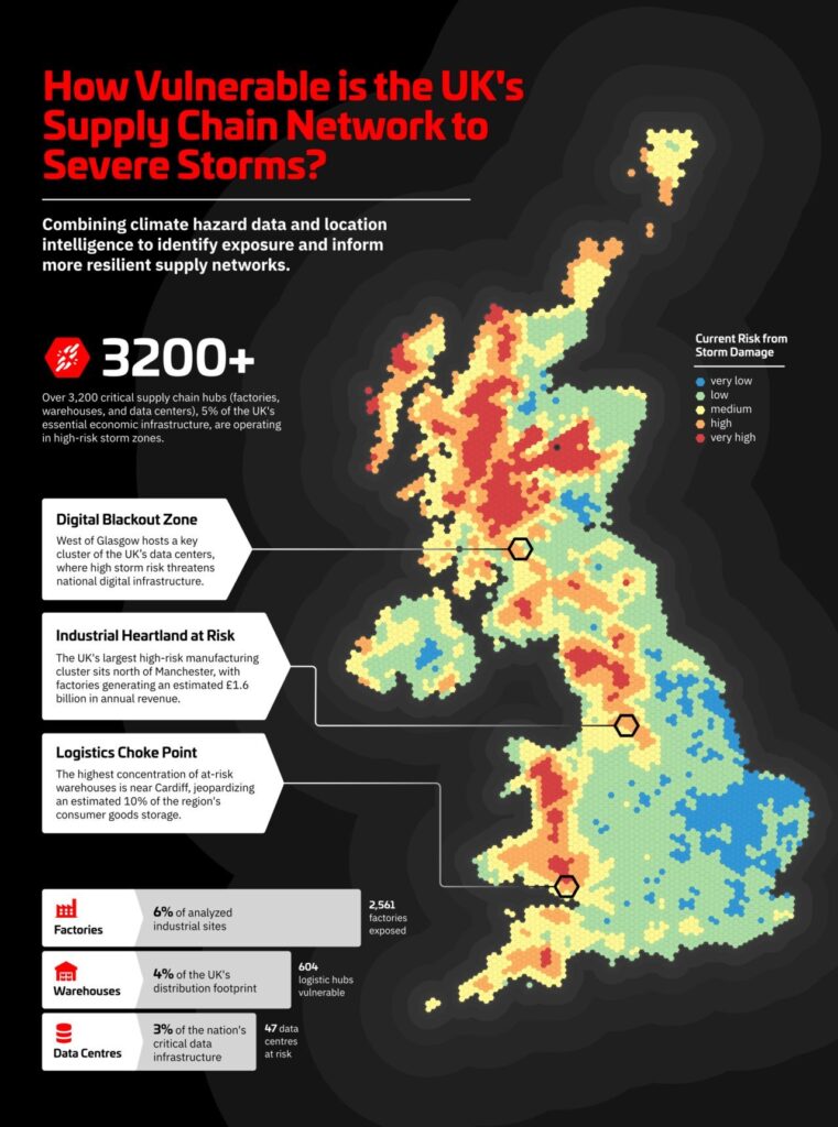
Source: Veridion on LinkedIn
While all these sites fall in high-risk zones, a closer look reveals that certain facilities carry outsized exposure: flood-prone data centers, warehouses near wildfire perimeters, and supplier nodes highly sensitive to heat-induced productivity losses.
Connecting each asset’s risk profile to its revenue contribution provides investors with a clear picture of future cash-flow stability and margin continuity.
Fortunately, by connecting each asset’s risk profile to its revenue contribution, you get a clearer sense of how climate exposure affects future cash-flow stability and margin continuity.
This is where risk-weighted valuation adjustments become essential.
For example, a logistics hub in a flood-prone region may see its intrinsic value decline, while a resilient data center in a low-risk area could justify premium allocation.
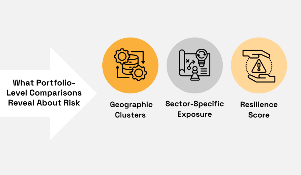
Portfolio-level comparisons further reveal hidden concentration risks, namely geographic clusters of high-value facilities, sector-specific vulnerabilities, or underappreciated resilience.
Source: Veridion
A useful real-world benchmark comes from Norges Bank Investment Management’s 2024 climate stress test.
Namely, their top-down modeling of the US equity portfolio under a Current Policy scenario found that the present value of average expected losses from physical climate risk is 19%, and 27% at the 95th percentile.
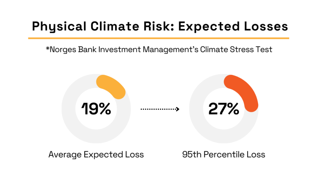
Illustration: Veridion / Data: NBIM
What’s important to note is that the NBIM acknowledges that the percentage is likely an underestimate due to the exclusion of:
This reinforces the importance of granular, asset-level data and probabilistic modeling to complement top-down approaches.
Probabilistic outputs also support mitigation decisions.
When you compare different adaptation costs, such as installing fire-resistant materials or relocating critical operations, against expected losses, you get a stronger framework for all capital planning.
In the end, thorough analysis of modeled results allows investors to pinpoint key vulnerabilities, evaluate comparative risk across assets, and guide evidence-based strategic decisions.
Raw climate hazard scores become meaningful only when translated into actionable insights.
By combining precise asset mapping, downscaled climate projections, damage modeling, and probabilistic assessment, investors can uncover hidden vulnerabilities, identify strategic mitigation opportunities, and strengthen portfolio resilience.
The workflow we outlined in this article will help you convert complex environmental data into intelligence that informs portfolio weighting, divestment, and valuation adjustments.
At the same time, this forward-looking lens enables you to anticipate and more effectively navigate emerging risks in an increasingly volatile climate landscape.